Magazine Advert:
.jpe)
Firstly, the advert quite clearly makes a point of the band. This is done by creating an image that takes up the majority of space in the ad. Also, by splitting the image into quarters, all four member of the group are highlighted and the idea that they each play a different role in the band (have independence) is emphasised as the parts of each face do not piece together perfectly (i.e. wonky features). However, as they each have a quarter is shows that they all have something in common (e.g. love for music, part of the band). By using an eagle to symbolise the band indicates a strength to the band (Iconography?). The font used throughout the advert is all very much the same and so could add to the star image; Is this unique to them? The typography is also visually quite digital, which connotes a modern touch to the band, something new. Furthermore, by using large font, both the name of tour/album and the band is very much emphasised to capture the attention of readers. The colour scheme to this is very dark, which reflects their genre of music (rock). The advert is portrait, meaning that it is single spread although it would still stand out as adverts are usually quite bright and so this would contrast. Also, other information is used for the benefit of the reader, for example 'OUT NOW' informs them of when/where it is available. Using such a broad statement could also be seen as an instruction almost and drive the reader to go an buy/download the track or album.

- Plan B is quite a well known rapper/actor in terms of being a 'bad boy'. I fell that this is highlighted through the use of colour. By using red on black, the dark side of something is quite clearly stated. This advert conforms to the generic conventions of a music for multiple reasons; The font is very much the same throughout the advert which adds to his star image. This includes his name, the album name and tour locations. This is important in terms of creating a connection between star image and the actual star that has created it. Also, sponsors and management as well as the album cover at the bottom. This familiarises the reader/audience with what artwork to look for when buying the album or track. Finally, back to the 'bad boy' theory, the use of hard lighting on the face of the artist fades into the advert quite nicely and makes him stand out. The idea that his name stands out more than his actual image connotes the idea that he may be more about building a reputation for his name rather than his actual image. Also, the suit contrasts with this reputation and almost creates a type of irony to his character.
After researching many magazine adverts (as shown above) I discovered many reoccurring conventions, these include; Larger font to emphasise name compared to small print of other details; Manager information; Release date; 'Includes *Track Name*'; Tour dates; Name of tour; Format; Availability; A coordinated colour scheme and finally,convincing quotes from media (i.e. Magazines, newspapers). From this I decided that my advert (shown below) would be made to be unique, however, I would include most of the conventions shown that qualify it as an advertisement.
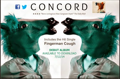
Here are some of the conventions I have included:
1. Name - The name of the DJ is shown to be a lot larger than the rest of the font alongside it appearing at the top of the advert. This creates an eye catching affect that will capture the attention of fans and other customers that come across the advert.
2. Quote - I have included a quote so that the advert seems more legitimate and professional. This also indicates exposure as it informs our audience of a personal view that is also a reliable source. This pairs with the 4 star rating that give the DJ a good reputation. As you can see I have made one up using The Daily Mail as the source.
3. Date/Availability - The release date for the album has been added in order to create awareness for our audience of the date at which the album will be released. It also uses the term download. This shows the format of the release and where people can get it (iTunes). I used this as I feel that our target audience will be younger people who are more familiar with the current changes when buying music and therefore we are reaching out to them.
4. Colour Scheme - Even though the horse mask is not this colour in the video, using Photoshop I changed the colours to reflect the energy of the video and put emphasis on the enthusiasm. This pairs well with the colour of the dates. I have done this in order for the advert to be eye catching and vibrant. The grey is also used to pair with the shirt that is worn. All of these colours have a purpose which is key in an advert.
5. Attractions - I have used the term 'Hit Single' also to capture the attention of readers as it makes the single seem popular, making more people want to be involved and in-the-know of what we're all about. This will then lead to them watching the video on social media and enjoying our entertainment.
Digi-Paks:

Images: The images included in the digi-pak of Amy Winehouse very much highlight her and her star image. We are able to identify that the album is hers (even if it did not have a title) due to her 60's look, including her statement eye makeup; her beehive hair style; large accessories (i.e. gold chains, hoop earrings, hair accessories); and the outfits we see her wearing. However, this star image has a twist. He makes it her own not only with the fact that she has tattoos, but she the idea that she is sure to show them off. The images used also portray her personality as quite innocent and angelic, which contrasts with her physical appearance. Inside this album, there is a book full of shots from a photo shoot with Winehouse by herself. These photographs alone strongly reinforce her 'innocence' due to the poses she makes, making her appear smaller with the use of vacant expressions where she may not even look at the camera. Also, the idea that she is surround by white colouring on the album cover reinforces this image further. Overall this contrasts highly with her actual image, creating irony throughout the whole digi-pak. Finally, she fills the frame in a lot of these images making her the main focus, which would be different for a band or even an artist that created a different genre of work.
Text: Amy Winehouse has claimed this font and as an audience we have associated this font with each of her albums and now it has become a part of her star image. It is very bold, perhaps in order to contrast with the images of her and is used to show her real personality. It is used on many of her albums and adverts that advertised her work. Therefore it would be easy for us to recognise it as hers. Furthermore, on the back of this digi-pak was a track list that appeared to be a photocopy of what she had written out herself, this made it feel that we had a true insight to what she had put into the able and created a connection between herself and her audience.
Our Digi-Pak:
After taking into account the digi-paks that I had already analysed, I was able to create a few ideas that would include all of the stereo typical codes and conventions of an artist digi-pak. Firstly, I chose a font that would be used throughout the digi-pak. This was called GEO Sans and came from the editing site PicMonkey. Even though this was the only digi-pak we created, we used it in hope to claim it as our own and have it recognised by the audience as ours. To reinforce this we used the same font on our magazine advert alongside the same images. I was sure to use images from the shoot we did as a group in order to make our star image clear. I did this also by including similar images throughout the digi-pak and advert. I also used an effect on each panel called 'Dusk' when editing the images in order for them to match and work alongside each other. I included a track list on the back and each one included a horse pun. This added humour to the album, giving the audience and idea of the personality of DJ Concord. Similarly to the Winehouse album, I was sure to fill the frame with an image of our star and including the font used on our ancillary products to make a statement. To connect with our audience I included two 'Shoutout Panels' that was a very short biography that highlighted the intentions of the artist and how thankful they were for the support making it appear that they relied on the fans and therefore making it appear that they were in control and gaining more fans overall. This created a connection between the audience and artist. Finally, to make the album appear more famous I included quotes from all respectable magazines/newspapers, that mentioned how much they loved the album and how catchy our new single was.


