Thursday, 5 December 2013

Sketches

Digi-pak Sketches:


As shown above, we were quite set on our final idea for our digi-pak and so I took on the role of sketching exactly what we had in mind. This includes a range of aspects that we thought were necessary; On the outside left panel I decided to have a close up image, selected from the shoot we did earlier in the project (to highlight the star image) to place on the front cover. This was the same image we used in our magazine advert. At the top of this panel we decided to have the name of our artist (CONCORD) and we were sure to use the same font as we did for the rest of the digi-pak as well as our advert. On the outside, right panel we thought it would look professional if we included star ratings and quotes from newspapers and magazines. These were obviously made up. However we did source the quotes from respectable, well known companies (i.e. GQ, DJ MAG, The Daily Mail).  On the inside right panel we included a panel dedicated to our fans to create a mutual connection. This was based around images with 'fans' and a quote of the artist in the middle, thanking and showing appreciation for the fans and their support. On the inside left panel we included a short biography, to inform our fans what the artist is all about and an expression of passion for music within the text. The point of this is to connect with the fans and potentially mould them into dedicated fans who care about the artist, not only for their music but as an individual. Obviously, between these inside panels, the CD slot will appear and behind will show an image relevant to the others on the digi-pak. Finally, the back panel will be used to show the tack-list, typed in the font used on the front panels. We will also include a small image of the front of the digipak (as noted) and a barcode to make it look official. This will be saved from google images. Also, there will be a bar at the top of this panel that shows the management of the album, sponsors and credit to those who took part. This was inspired by other digi-paks (e.g. Kanye West). 


Magazine Advert:


For the magazine advert I came up with a few possible ideas that could be printed in a magazine for exposure of the artist and the single. Even though we did like a few, our final is shown in the bottom left corner of the image above. This shows a double spread (landscape) image, as we feel it would capture the attention of readers more than just one page that would merge with other advertisements. If it is shown on a double page it will be it will be dedicated to our artist and is more likely to stand out. We plan to use bright colours (Blue) on a white background using Photoshop to edit an image from our shoot. This colour scheme will reflect the 'loudness' of the video itself as well as the special effects included (i.e. ...). However, using this colour scheme will challenge the colour scheme chosen for the digi-pak (ironic approach). In this advert we would also like to include ratings and quotes from magazines as shown on the digi-pak panel. Also, quite importantly we would include the release dates of the album, the most popular track, availability to download and where to download. 

Shot List


  • Firstly, we use a tilt shot. We do this to establish the artist and their star image. As the artist is dressed in the same way in all of their appearances, it was important to use this shot to show this in order for the audience and fans to be able to associate the costume with the artist themselves. The tilt shot alternative between two different costumes that appear throughout the video (natural costume and costume with props). This makes us familiar with what we should expect while we are watching as well as what to expect during the future of the artist and their work.
  • The next shot is a POV/tracking shot. This shows another aspect of the costume used during the video. Also, this gives the illusion that the audience are the ones skating. Also, it reveals something about the personality of the artist and their image.
  • The next shot is a pan and goes hand in hand with the previous shot as we get to view the artist on the skateboard from a different perspective.
  • The next is a close-up of the horse mask itself. This part of the costume is key in terms of our star image and what we aimed to create. This is the meat dress of Lady GaGa, the masks of Daft Punk and the hair of Miley Cyrus.
  • We then use a long shot that shows the statement dance of the video. We al have a young person (to reflect our target audience) in the background on a BMX. As we show a skate park, our variety of locations we have included in the video are kicked off. In this way it could also be classed as an establishing shot.
  • The next shot is the first handheld shot. It includes a completely different setting, involving complete darkness aside from the LED's that we are using as a prop. These bright lights reflect the personality of our artist and the overall tone of the video. LOUD.
  • After this, we have a high angle shot in order to capture the amount of people surrounding  our artist to highlight their popularity as well as the amount of young people in a 'party environment' to reflect our target audience. The audience of this age group could then relate to the setting and it is promoting the 'high life' that teenagers would like to have. We also colour corrected it and added colouring effects to make the shot more lively.
  • This is another long shot with the purpose similar to the fifth shot. This shot also reflects in our rhythmic editing as the dance moves with with the beat of the music. 
  • We have another close up (Shot #2).
  • We have a really fast passing medium close-up of the silhouette profile of our artist. This is used to show a different view of our artist.
  • (SHOT #7)
  • (SHOT #6)
  • We then use a close up of our artist driving. This explores a new location of our driver which are target audience are familiar with.
  • The next shot is a long shot of the shadow of our artist dancing. This is a test for our audience to see whether they have picked up on the star image.
  • This shot starts as a medium close-up and then turns into an extreme close-up. This shows a new location as well as the artist in a different iconic outfit.
  • This shot is the second part of the previous and shows the statement dance of our artist in the new location - waterfront. It almost qualifies as an establishing shot as the next few show  the sites of Ipswich Waterfront.
  • We then use an areal shot of the artist in this area to add to the variety of shots we have used throughout the video. Also, the stereotypical 'vulnerable' meaning of the high angle shot contrasts with the independence and importance of the character.
  • The next shots are the repeats of previous but are used to show the use of dance like effects during the video that reflect the build up of the music (towards the drop).
  • (Sped up version of first shots, to reflect the pace of the video compared to the beginning.
  •  From this moment on the shots are repeated, and effects are added to create a new effect.


Thursday, 17 October 2013

Audience Feedback & Decided Improvments


Here is an example of one of our questionnaires ^
(Tanzy's copy)
We asked 40 17-25year olds about our star image, narrative of the video, our song and what they thing should be improved. From our market research we found that 80% of the participants liked our horse mask narrative, one of the comments included that they found it 'funny' and 'interesting' and are extremely excited to see our final piece. The majority of the participants found our star image was good and they enjoyed the idea that our DJ is anonymous which gave a different edge to our video.  30% of the participants felt our song choice could be improved because the tracks are too 'jumpy' and don't connect well. However the majority of the participants did  like our song and felt it would go well with our narrative and dance routine.  Another comment was to include lip-syncing, but we are not sure how to include this because the main characters are wearing masks it could be hard to incorporate. Some people also suggested that we should use a range on camera angles and styles to increase the variety of shots and add more styles and more flare.  From the market research, we will take into account the range of camera angles and shots, because we think it is a valid point that our video needs variety to keep the audience's attention. This is important in a music video because it is made to promote the song and give the artist exposure. If the audience doesn't enjoy the video they are less likely to share it with their friends and across the internet, which in consequence doesn't promote the video. The  track itself, may be jumpy but we intend to correlate this through the editing. Through rhythmic editing, we can make the track and video reflect each other.  


Conventions of a Music Video

Risk Assessment


As shown below is our risk assessment assembled by Conor & Louisa who had the role of taking into consideration the hazards of filming in our chosen locations.


Tuesday, 8 October 2013

Lighting Plan


As shown in the sketch above we plan to use natural lighting in the majority of our outdoor/daytime shots. We want to use reflectors in order to capture the sunlight to highlight the subject that will be positioned in the centre of the frame so that they're the main focus. Also, using the reflectors will make the stars stand out from the general public in locations such as the town centre.

Secondly, in the sketch below it is explained that in any indoor/nighttime shots we plan to use soft boxes to create a light that isn't too blatant in the shots. We would like the lighting to look as natural as possible in order to match all of the other shots (outdoor). For this to be possible in places such as the car we hope to create our own using an ordinary LED light and covering it in tracing paper to achieve the same effect as a soft box. These will in turn eliminate all shadows and make the video look professional overall.


Storyboard


Storyboards 


After careful consideration we decided that our storyboard are unrealistic and some changes may occur once we start our filming/editing. Firstly, our shots tend to be around 4 seconds long which is unlikely once it gets to our final video. When we reach our editing stage the shots will be more sharp and fast so that the pace of the video reflects the chosen music piece. ALso, most of the shots have been planned to be static. This is a problem as it makes the video seem longer and possibly tedious. Using tracking or dolly shot to capture more movement so that the video doesn't get boring as well as the result of heightening their interests.


Treatment

Thursday, 3 October 2013

Digipack & Magazine Advert

Magazine Advert:


Analysis:


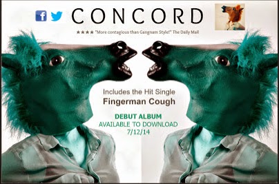
Firstly, the advert quite clearly makes a point of the band. This is done by creating an image that takes up the majority of space in the ad. Also, by splitting the image into quarters, all four member of the group are highlighted and the idea that they each play a different role in the band (have independence) is emphasised as the parts of each face do not piece together perfectly (i.e. wonky features). However, as they each have a quarter is shows that they all have something in common (e.g. love for music, part of the band). By using an eagle to symbolise the band indicates a strength to the band (Iconography?). The font used throughout the advert is all very much the same and so could add to the star image; Is this unique to them? The typography is also visually quite digital, which connotes a modern touch to the band, something new.  Furthermore, by using large font, both the name of tour/album and the band is very much emphasised to capture the attention of readers. The colour scheme to this is very dark, which reflects their genre of music (rock).  The advert is portrait, meaning that it is single spread although it would still stand out as adverts are usually quite bright and so this would contrast. Also, other information is used for the benefit of the reader, for example 'OUT NOW' informs them of when/where it is available. Using such a broad statement could also be seen as an instruction almost and drive the reader to go an buy/download the track or album.


  • Plan B is quite a well known rapper/actor in terms of being a 'bad boy'. I fell that this is highlighted through the use of colour. By using red on black, the dark side of something is quite clearly stated. This advert conforms to the generic conventions of a music for multiple reasons; The font is very much the same throughout the advert which adds to his star image. This includes his name, the album name and tour locations. This is important in terms of creating a connection between star image and the actual star that has created it. Also, sponsors and management as well as the album cover at the bottom. This familiarises the reader/audience with what artwork to look for when buying the album or track. Finally, back to the 'bad boy' theory, the use of hard lighting on the face of the artist fades into the advert quite nicely and makes him stand out. The idea that his name stands out more than his actual image connotes the idea that he may be more about building a reputation for his name rather than his actual image. Also, the suit contrasts with this reputation and almost creates a type of irony to his character.


After researching many magazine adverts (as shown above) I discovered many reoccurring conventions, these include; Larger font to emphasise name compared to small print of other details; Manager information; Release date; 'Includes *Track Name*'; Tour dates; Name of tour; Format; Availability; A coordinated colour scheme and finally,convincing quotes from media (i.e. Magazines, newspapers). From this I decided that my advert (shown below) would be made to be unique, however, I would include most of the conventions shown that qualify it as an advertisement.

Here are some of the conventions I have included:
1. Name - The name of the DJ is shown to be a lot larger than the rest of the font alongside it appearing at the top of the advert. This creates an eye catching affect that will capture the attention of fans and other customers that come across the advert.
2. Quote - I have included a quote so that the advert seems more legitimate and professional. This also indicates exposure as it informs our audience of a personal view that is also a reliable source. This pairs with the 4 star rating that give the DJ a good reputation. As you can see I have made one up using The Daily Mail as the source.
3. Date/Availability - The release date for the album has been added in order to create awareness for our audience of the date at which the album will be released. It also uses the term download. This shows the format of the release and where people can get it (iTunes). I used this as I feel that our target audience will be younger people who are more familiar with the current changes when buying music and therefore we are reaching out to them.
4. Colour Scheme - Even though the horse mask is not this colour in the video, using Photoshop I changed the colours to reflect the energy of the video and put emphasis on the enthusiasm. This pairs well with the colour of the dates. I have done this in order for the advert to be eye catching and vibrant. The grey is also used to pair with the shirt that is worn. All of these colours have a purpose which is key in an advert.
5. Attractions - I have used the term 'Hit Single' also to capture the attention of readers as it makes the single seem popular, making more people want to be involved and in-the-know of what we're all about. This will then lead to them watching the video on social media and enjoying our entertainment. 

Digi-Paks:

Images: The images included in the digi-pak of Amy Winehouse very much highlight her and her star image. We are able to identify that the album is hers (even if it did not have a title) due to her 60's look, including her statement eye makeup; her beehive hair style; large accessories (i.e. gold chains, hoop earrings, hair accessories); and the outfits we see her wearing. However, this star image has a twist. He makes it her own not only with the fact that she has tattoos, but she the idea that she is sure to show them off. The images used also portray her personality as quite innocent and angelic, which contrasts with her physical appearance. Inside this album, there is a book full of shots from a photo shoot with Winehouse by herself. These photographs alone strongly reinforce her 'innocence' due to the poses she makes, making her appear smaller with the use of vacant expressions where she may not even look at the camera. Also, the idea that she is surround by white colouring on the album cover reinforces this image further. Overall this contrasts highly with her actual image, creating irony throughout the whole digi-pak. Finally, she fills the frame in a lot of these images making her the main focus, which would be different for a band or even an artist that created a different genre of work.
Text: Amy Winehouse has claimed this font and as an audience we have associated this font with each of her albums and now it has become a part of her star image. It is very bold, perhaps in order to contrast with the images of her and is used to show her real personality. It is used on many of her albums and adverts that advertised her work. Therefore it would be easy for us to recognise it as hers. Furthermore, on the back of this digi-pak was a track list that appeared to be a photocopy of what she had written out herself, this made it feel that we had a true insight to what she had put into the able and created a connection between herself and her audience.

Our Digi-Pak:


After taking into account the digi-paks that I had already analysed, I was able to create a few ideas that would include all of the stereo typical codes and conventions of an artist digi-pak. Firstly, I chose a font that would be used throughout the digi-pak. This was called GEO Sans and came from the editing site PicMonkey. Even though this was the only digi-pak we created, we used it in hope to claim it as our own and have it recognised by the audience as ours. To reinforce this we used the same font on our magazine advert alongside the same images. I was sure to use images from the shoot we did as a group in order to make our star image clear. I did this also by including similar images throughout the digi-pak and advert. I also used an effect on each panel called 'Dusk' when editing the images in order for them to match and work alongside each other. I included a track list on the back and each one included a horse pun. This added humour to the album, giving the audience and idea of the personality of DJ Concord.  Similarly to the Winehouse album, I was sure to fill the frame with an image of our star and including the font used on our ancillary products to make a statement. To connect with our audience I included two 'Shoutout Panels' that was a very short biography that highlighted the intentions of the artist and how thankful they were for the support making it appear that they relied on the fans and therefore making it appear that they were in control and gaining more fans overall. This created a connection between the audience and artist. Finally, to make the album appear more famous I included quotes from all respectable magazines/newspapers, that mentioned how much they loved the album and how catchy our new single was.


Audience Profile


Why do people listen to dance music?
It is clear that the audience for this genre enjoy the sound of the music. They enjoy the rhythm and dance-ability of the songs that have a club-like feel. It’s also considered an unconventional genre; compared to others, as it experiments with different electronic sounds and uses heavy beats to excite the listener.  The image on the left is that of the biggest and best selling electronic/dance music magazine that has been in circulation since 1982 and has sold over 20,000 editions. Originating from England, it mainly contains information on club nights, artists, concerts venues, dance events and music reviews. These are just some of the subject matters I would like to promote on my music magazine. 


Technology impact
Due to the genre being modern and current, a typical way of accessing the music is on official music purchasing industries like iTunes. CD's are beginning to lower in popularity because of the move in technology that has uncovered the iPod, MP3 players and phone; all popular pieces of personal and portable equipment that is easy and simple to load music onto. They're definitely more accessible and fashionable to own.


Social networking: As our genre is a hybrid, there is no official page for electro-pop/dance music. The dance music page has 1,154,817 likes, the electro music page has 740,572 likes and the pop page has 8,222,819 likes. All genres are popular and have a broad audience, but together, you could say a niche audience is created because of the mix of all the varieties. The audience members who enjoy this genre appreciate all the genre qualities that create the overall hybrid. Successful artists like Lady GaGa and Usher are present on the global social networking sites like Facebook, Twitter and are some of the most followed/liked people in the world. Also, their popularity is extended to owning a website and possibly running a fashion and clothing line. 


Feedback from focus group
I gave my peers a list of genres to choose from. This allows me to assess the most popular music genres; people of my age group (16 - 17) enjoy the most. However, this is a very small sample of a large sixth form so my test isn’t an accurate representation of the genres favoured on a larger scale. These were the results.


As shown above, pop was the most popular genre 16 - 17 year olds prefer. I expected this but electro and dance music is still quite popular. I think it’s because of the heavy sound, club connotation and the various artists that feature in the genre, a few of which I will explain more about later on this page.


Primary audience:
Demographic
Typically my primary audience will be aged 16 – 25 and may still be in education; e.g. University, College or Sixth Form. A mix of males and females is clear as the genre doesn't cater specifically for a certain gender. They will be of white British ethnicity. Typically they will derive from a medium economic class status and will uphold a C2 (skilled manual) - D (semi-skilled/unskilled manual) social class status.

Psychometric
A typical member of my audience will enjoy listening to radio 1 and watching MTV as electro-pop/dance is a common genre in the charts. They will be an avid user of social technology; having accounts on Twitter and Facebook. They may enjoy television shows like Top Gear and The X Factor and taking part in activities like swimming and a sport. Some may play an instrument like the piano or a guitar. Typically, they would be aspirers; looking to achieve goals and dreams in their lives.

                                                                  Secondary audience:
Demographic
My secondary audience will be aged 26 – 35 and will be white British males and females as my genre doesn't cater for specific genders. They will be maintaining a medium economic class position and will uphold a profession in the B (middle management/administrators or professionals) - C1 (supervisors /clerical/junior management) regions.

Psychometric
A member of my secondary audience will lead a heavy social life and may enjoy activities like clubbing, dancing and possibly playing a musical instrument; brought through from their childhood. They may enjoy listening to radio 2 or Heart and like TV programmes like EastEnders. These people would sit in the succeeders lifestyle region as they’ve achieved targets from their early aspirer status.


Example Artist: David Guetta had huge success with his 2011 electro/house and dance/pop album “Nothing but the beat.” The idea of the “beat” is a convention to my genre as a heavy beat is featured in many songs. David Guetta is simply the producer and composer so his songs are sung by a range of artists including Kelly Rowland, Sia and Nikki Minaj. This is a why his music appeals to a broad audience.


Thursday, 19 September 2013

Star Image - Rihanna


R I H A N N A


Basic Details, Relevant Genres & Early Star Image 


Rihanna (originally Robyn Rihanna Fenty) leads a very successful music career due to her significant star image, her range of genres and other roles in terms of media and using these as pathways to success. Rihanna is different from other artists because of her wide target audience in terms of the genres she covers (e.g. R&B, pop, reggae, hip hop and dance). Starting from the beginning, her star image was very innocent. She was moulded in a way to fit the norm of typical teenage girls. This was her starting point. As you can see she was structured in a way to make her seem normal, just like any other teenage girl. Her innocence was conveyed by her natural features. In this way she was able to create a character that everyday girls aspired to be like. This work well with the confidence she showed in what she wore (crop tops, ripped jeans) as maybe in everyday life this wouldn't be acceptable and so a desirability in her female fan base grew as they wanted to be like her. This image was carried through her earlier videos as if to create and impression, as she was a new artist, this image would have been important to keep the audience interested as it isn't usual to have a young independent artist (rather than girl band) that young girls can look up to. She was made into a role model.


Development of Star Image

 
 Gradually, over the years Rihanna's career has thrived on her appearance and motifs. She is mainly known in the modern days of her career that she is known for her sex appeal, her

emotions at the time and her style. All of these being reflected in the artwork of each album.
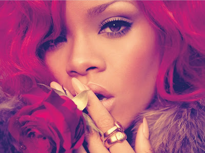
Her main motif is her hair. Her hair colours/styles represent the stages she is going through in her life as well as making a statement to draw in a wider audience. It could be said that with each album she is introducing a new persona, one that is not exposed often in the real world and can only be expressed through music. This is beneficial to her as her audience keeps interest. As shown to the right her innocence was soon taken over by an attempt to creating an older character. Cleverly she was still able to keep her teenaged attitudes yet she widened her audience as people took her more seriously when she decided to cut it short. This made her appear more mature and seemed as if she could relate to older audiences as she was taking her career more seriously. This was a kick start to the planned and perhaps not so planned stages of her life/experiences. After this came she decided to take this a little bit further and gained her first bit of sex appeal. Instead of the gentle teenaged make up she was transformed into a woman with short
hair that matched her dark make up, making her more sexy. This difference obviously got her more attention as now she was now a 'grown-up' experimenting with new things in order to gain fame. At this point she was also gaining more recognition for her tattoos. This was then a beginning to another motif (getting inked). In 2010 her career took a dip due to negative life events she had experienced. This was symbolised hugely in her album
'Rated R'. Her image changed completely. She was changed into a character that came across as careless but not in a positive way. Her style changed into more daring. As her outfits got more revealing her attitude got more aggressive. Instead of being an independent young woman, Rihanna started associate with rappers that gave her performance a bit more edge as well as building a new reputation. Her makeup changed from (suitable) to very dirty looking, she almost looked as if she hadn't been washing. This idea was conveyed not only through her image but her videos. A lot of the music she made on this album was very dark and strayed from her roots of pop by as she sung meaningful lyrics that reflected her life at that time. However this was turned around with 'Loud' in 2011 when she turned her music back around and made it bigger than ever. Her image sustained the innocence that she started out with, a respectable amount of sex appeal and an 'act-your-age' image that formed a whole new audience. This album was created based on her happiness. However, her career thrived on this album due to the experimenting she did when creating this album. Many new genres that she had never sold before were introduced which created an even wider audience due to a range of different interests she was offering in terms of music. The album included reggae, which allowed her audience to get in touch with her roots and how she genuinely started out. She was exposing her culture like never before. However, in the most recent times of her career it would seem that she is putting everything into her singing rather than making a statement. Both herself as an individual and her career have benefitted from her calming down and acting more mature.


Widening Her Audience


In the most recent times of her career, Rihanna has expanded her career with many different types of media that add to her capabilities. By spreading herself like this she is enabling the chances of creating a larger fan base. One of the opportunities she has pursued is in the film industry. She has proved that not only is she a world wide known singer that people love, she can also gain exposure through acting. She has acted in a few well known films along with very famous actors that we are all familiar with. For example, one of the most famous movies would be Battleship (2012) starring the one and only Liam Neeson! However, this is not only the only way she has targeted a wider audience, she also has her own clothing line. Riri partnered up with River Island and started her own clothing line and a very successful one at that. Rihanna said her clothes are aimed at a variety of women, but said they are all pieces she would wear herself.
 

“I would wear everything here. I was being a little bit selfish. I designed everything that I would want to wear, and for the women that I’m with”
 
 
RIVER ISLAND PRESENTS: THE AUTUMN RIHANNA FOR RIVER ISLAND LAUNCH


How Is She Sold?

Throughout her career from start to finish close ups have been used to highlight her image. The camera is always focussed on her and she will always be in shot. The majority of the time, if she is not the only thing in the frame she will be shown doing something seductive or continuous eye contact will be used to ensure that she is the main focus. In this way the hair statement as noted above are reinforced to reflect her mood and what she stands for. If the shot includes people, they tend to be focussing on her and surrounding her which also creates an effect that draws our attention as an audience to what they're looking at. The use of editing reinforces this as cutting to close ups is a regular feature that but emphasis on her faces. Her face is a chosen image as it highlights her beauty and her eye contact with the camera. This is a way to connect with her audience and letting them feel more involved with the video.


Why is She Popular in Present Day?

Rihanna's fame has stemmed from her constant pushing of boundaries in today society. Her clothes are always very revealing but not in a way that she wouldn't look respectable. She rocks the sex appeal goal. In this way, her fan base and even those who claim to dislike her/her music aspire to be as confident as she is. Also, as mentioned before she participates in many different genres which gives people an opportunity to enjoy all aspects of her music. Also, her influences are very famous singers which may make her more attractive to fans. Bob Marley and Madonna are those who drive Rihanna and also are from either ends of the spectrum. Once people know this they tend to dip their toe into her music career which benefits her. Also, in todays society, to gain exposure social networking sites (e.g. Twitter/FB/Instagram) are very important. Those who aspire to be like her gain from getting a constant insight of her life on these sites. Just like many artists Rihanna is constantly updating her fans of what she is doing and sometimes even asking for their opinions to get there more involved. These sites help fan feel like they have more of a connection with her just like they would a friend. In this way she is very trendy and people love that she is doing the same things they do in their spare time. Also her clothing and makeup line come from companies that are particularly popular with teenagers. Therefore, people associated the two and buy what she had taken part in making in order to fit the norm and become more like her.


Sunday, 15 September 2013

#3 Textual Analysis - Lost & Not Found (Abstract)


Chase &  Status - Lost & Not Found

--------------------------------------------------------------------------------------------------------------------

Mise-en-scene:

At the start of the video we are shown a 'Missing' poster on a lamp post. This could be used as an introduction to the narrative of the video, relating to what is perhaps 'Lost & Not Found'. Her appearance reoccurs throughout the video, this form of repetition could be used for emphasis of her importance. We are also shown a young boy on a bike located on a side walk in an American street setting. We know nothing of him and he doesn't seem to have any significance at that particular moment. However, as he begins to move, the camera follows and he becomes a vehicle in which the audience latch onto as we are shown to different parts of the surroundings. This role of vehicle is passed around through different types of characters as the video goes on. In this way we are also getting a feel of what kind of people potentially live in the area. These characters include a range of people in different costumes, showing different habits (smoking), different status', different occupations and different emotions. As this isn't a particularly clear cast, it could be a second interpretation of the title in that those in the video are lost or do not fit in with society.The have been deindividuated as people. Moving on we are shown a number of situations, including a car accident and consumption of drugs, after which the police turn up. This could lead the audience into a feel of confusion in terms of what is to come next and why the police have arrived considering the number of situations. As we are lead into small apartments we are introduced to more characters, one of which is a man crying in a bath tub. This is another example of the audience potentially being confused of the storyline, are there many story lines, is the video exaggerating how we do not give people enough time and highlighting our judgement. After the male character crying in the bath, the camera focuses on a television showing a news channels, this shots lasts loner than the rest which suggests significance in the character. As an audience we are likely to remember him. Although, we do not have to for long as he appears in shot while the police bring him down . This makes the moment more real as it is what we have just seen on the television. What has he done? As the video comes to a close we get the opportunity to become clear of what the relevance of the song name is in terms of the video. This is because we are once again shown the female that appeared on the lost poster at the start of the video. This suggests that after al this time and throughout the video we have potentially been on a journey to find her, which turns out to be a success when she appears on screen. Just as the whole thin starts to make sense and the 'lost' female is led from the apartment while the male on the news is arrested, there is a small twist that adds more confusion. At this point we are under the impression that he has kidnapped her, however, she take a turn for the worst and helps the protagonist. This brings in another argument as to whether she is still the victim and what were we looking for to being with. The police wrap her up in a blanket making her appear vulnerable, adding to her 'missing' story. There is a contrast in the shot as we exit the apartment as she is being comforted by the police officer as the male in the background struggles.  Adding another meaning to the title. At this point the couple are our vehicle and we become a part of the crime. Finally, we are passed back to the young boy on his bike, in the same way as the begginning. This creates a loop effects in that it seems as though we are going round and round in circles as this is the way we started. Throughout the whole  video, not once are Chase & Status shown.

---------------------------------------------------------------------------------------------------------------

Camera:

As mentioned before, we are constantly in motion. This is done with the use of a Dolly within a trackinshot. Differently from most other music videos, this particular one completes the whole course of the video in one shot. Even though there are no cuts or transitions due to the single shot the video ranges with camera angles and shot types. These include, close up that identify significant characters and moments (i.e.. the news on television, missing poster), medium close ups for the majority of the sceneries giving them equal significance. As the video is filmed as one, the storyline is revealed in one go.

---------------------------------------------------------------------------------------------------------------

Sound:

Just before the track starts the video is introduced with a number of dieetic and non-dieetic sounds.